
Compose中,AlertDialog圆角设置无效,或四角出现白色背景的解决方式
创始人
2025-05-30 15:59:48
0次
注:解决方式在最后。
一、问题复现
Compose Desktop,AlertDialog代码如下:
AlertDialog(modifier = Modifier.clip(RoundedCornerShape(10.dp)).fillMaxHeight(0.3f).fillMaxWidth(0.35f).background(Color.White).padding(20.dp),title = null,text = { /* 略 */ },buttons = { /* 略 */ })
这里设置了RoundCornerShape圆角,弹出的对话框如图:
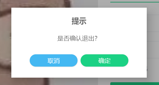
发现是没有圆角的。根据网上查到的信息,设置 AlertDialog 的背景为透明,无效。
当我给这个dialog设置背景色,如:
AlertDialog(modifier = Modifier.clip(RoundedCornerShape(10.dp)).fillMaxHeight(0.3f).fillMaxWidth(0.35f).background(Color.Red) // 设置背景色为红色.padding(20.dp),title = null,text = { /* 略 */ },buttons = { /* 略 */ })
结果如图:
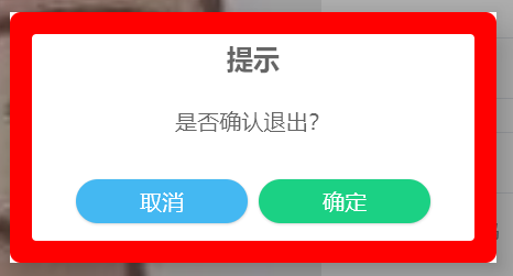
可以看出,这多半是 AlertDialog 父组件的背景色,而不是 AlertDialog 自身的原因。
二、原因分析
根据 AlertDialog 的源码来看,其界面是通过 dialogProvider 来提供的。
fun AlertDialog(onDismissRequest: () -> Unit,buttons: @Composable () -> Unit,modifier: Modifier = Modifier,title: (@Composable () -> Unit)? = null,text: @Composable (() -> Unit)? = null,shape: Shape = MaterialTheme.shapes.medium,backgroundColor: Color = MaterialTheme.colors.surface,contentColor: Color = contentColorFor(backgroundColor),dialogProvider: AlertDialogProvider = PopupAlertDialogProvider
) {with(dialogProvider) {AlertDialog(onDismissRequest = onDismissRequest) {AlertDialogContent(buttons = buttons,modifier = modifier.width(IntrinsicSize.Min),title = title,text = text,shape = shape,backgroundColor = backgroundColor,contentColor = contentColor)}}
}
而 dialogProvider 的默认实现是 PopupAlertDialogProvider,其中界面部分的代码如下:
Box(modifier = Modifier.fillMaxSize().background(scrimColor).pointerInput(onDismissRequest) {detectTapGestures(onPress = { onDismissRequest() })},contentAlignment = Alignment.Center
) {Surface(Modifier.pointerInput(onDismissRequest) {detectTapGestures(onPress = {// Workaround to disable clicks on Surface background https://github.com/JetBrains/compose-jb/issues/2581})}, elevation = 24.dp) {content()}
}
其中,对话框就是其中的 Surface 部分。而 Surface 的默认背景颜色就是白色。
问题找到了,就好解决了。
三、解决
- 新建一个
CustomDialogProvider,并复制PopupAlertDialogProvider的代码。
将其中的Surface背景改为透明。
import androidx.compose.foundation.background
import androidx.compose.foundation.gestures.detectTapGestures
import androidx.compose.foundation.layout.Box
import androidx.compose.foundation.layout.fillMaxSize
import androidx.compose.material.AlertDialogProvider
import androidx.compose.material.ExperimentalMaterialApi
import androidx.compose.material.Surface
import androidx.compose.runtime.Composable
import androidx.compose.ui.Alignment
import androidx.compose.ui.Modifier
import androidx.compose.ui.awt.awtEventOrNull
import androidx.compose.ui.graphics.Color
import androidx.compose.ui.input.key.KeyEventType
import androidx.compose.ui.input.key.type
import androidx.compose.ui.input.pointer.pointerInput
import androidx.compose.ui.unit.*
import androidx.compose.ui.window.Popup
import androidx.compose.ui.window.PopupPositionProvider
import java.awt.event.KeyEvent@OptIn(ExperimentalMaterialApi::class)
object CustonDialogProvider : AlertDialogProvider {@Composableoverride fun AlertDialog(onDismissRequest: () -> Unit, content: @Composable () -> Unit) {// Popups on the desktop are by default embedded in the component in which// they are defined and aligned within its bounds. But an [AlertDialog] needs// to be aligned within the window, not the parent component, so we cannot use// [alignment] property of [Popup] and have to use [Box] that fills all the// available space. Also [Box] provides a dismiss request feature when clicked// outside of the [AlertDialog] content.Popup(popupPositionProvider = object : PopupPositionProvider {override fun calculatePosition(anchorBounds: IntRect,windowSize: IntSize,layoutDirection: LayoutDirection,popupContentSize: IntSize): IntOffset = IntOffset.Zero},focusable = true,onDismissRequest = onDismissRequest,onKeyEvent = {if (it.type == KeyEventType.KeyDown && it.awtEventOrNull?.keyCode == KeyEvent.VK_ESCAPE) {onDismissRequest()true} else {false}},) {val scrimColor = Color.Black.copy(alpha = 0.32f) //todo configure scrim color in function argumentsBox(modifier = Modifier.fillMaxSize().background(scrimColor).pointerInput(onDismissRequest) {detectTapGestures(onPress = { onDismissRequest() })},contentAlignment = Alignment.Center) {Surface(Modifier.pointerInput(onDismissRequest) {detectTapGestures(onPress = {// Workaround to disable clicks on Surface background})},elevation = 24.dp,color = Color.Transparent  // 修改背景色为透明) {content()}}}}
}
- 在 AlertDialog 参数中,加入自定义的 DialogProvider。
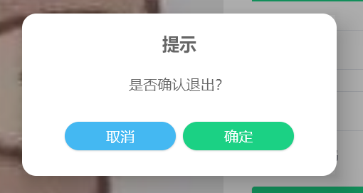
AlertDialog(modifier = Modifier.clip(RoundedCornerShape(10.dp)).fillMaxHeight(0.3f).fillMaxWidth(0.35f).background(Color.White).padding(20.dp),dialogProvider = CustonDialogProvider, // 添加自定义的 DialogProvidertitle = null,text = { /* 略 */ },buttons = { /* 略 */ })
再次运行代码,发现圆角正常显示了:
当然,我们也可以通过在 Theme 中设置 Surface 的颜色,达到相同的效果:
MaterialTheme(colors = MaterialTheme.colors.copy(surface = Color.Transparent)) {// 略}
不过这样就会改变所有Surface 的颜色了。
相关内容
热门资讯
走进小城看消费丨江西资溪:低碳...
夏日时节下午4点,江西省抚州市资溪县大觉山景区漂流终点依然热闹。来自南昌的游客余鑫漂流结束后没有...
【中原晨会0625】市场分析专...
来源:市场资讯 (来源:中原证券研究所) 本期重点研报目录 【中原策略】市场分析:电子半导体领涨 ...
南向资金连买4日!低费率+可月...
6月25日早盘,港股红利资产震荡整理。截至11时14分,港股红利低波ETF招商(520550)下跌0...
618成交破百万!紫荆花用一套...
一年一度的618年中大促,是消费市场的晴雨表,也是品牌间最激烈的角力场。当各大品牌在直播间里铆足了劲...
原创 黄...
2026年6月25日的国际金价已经从前期的5500美元高点跌到4200美元下方,累计跌幅超过22%,...
英伟达CEO:Vera Rub...
截至9:38,中证半导体材料设备主题指数(931743)涨2.36%创新高;权重股中,中微公司涨3....
再被催债16亿!“钢铁大王”戴...
澎湃新闻记者 贺梨萍 因“铁本事件”入狱五年的戴国芳重返钢铁行业,但他并没有完成从阶下囚再到“钢铁大...
周三原油价格下跌
随着美国和伊朗在和平谈判中取得进展,越来越多的油轮公开穿越霍尔木兹海峡,原油在战时的价格上涨已经蒸发...
这种蛋白是大脑衰老的开关
这种蛋白是大脑衰老的开关 清晨,假设一位五十岁左右的王女士发现自己常常把手机放在熟悉的抽屉里又找不到...
信通院牵头算力Token出海生...
盘面上,截至11:04,中证科创创业50指数(931643)涨1.68%,创历史新高;权重股中,芯原...
海外 774 亿营收背后:日本...
文 | 游戏价值论 6月23日,彭博社报道了腾讯正在围绕出售多家日本游戏工作室少数股权开展谈判,包...
餐饮“抢人”大战:把店开到公交...
作者 |餐饮老板内参 内参君 医院、公交站、演唱会…餐饮品牌,正在无孔不入 在北京儿童医院,肯德基...
快讯 | 外资扫货!陈翊庭:港...
港交所行政总裁陈翊庭在接受《中国证券报》专访时指出,国际资本对中国资产的看法已彻底扭转,布局中国市场...
2777.77元!A股“股王”...
25日早盘,昨天创下历史新高的A股“股王”联讯仪器,今天上午继续走强,盘中股价再度刷新历史新高。 截...
原创 今...
欧洲自己的媒体直接下结论,欧盟衰退躲不掉,内部分裂拦不住,现在就连欧洲顶尖工业巨头,都偷偷在用中国的...
黄仁勋股东大会放言:本轮AI基...
在当地时间6月24日的英伟达(NVDA.O)2026年度股东大会上,股东批准了该公司全部10名董事会...
国际油价大跌
新华社消息, 纽约原油期货主力合约价格24日盘中跌破每桶70美元,为伊朗战事爆发以来首次。 市场分析...
马云带队插秧,什么信号?
一场别开生面的“务农”,让外界看到了一个不一样的阿里巴巴。 近日,阿里巴巴合伙人、高德董事长刘振飞在...
全球最大产能,最高丰度达99....
本文转自【科技日报】; 6月23日,高丰度硼-10同位素技术暨产业化成果发布会在山东省东营市举办,全...
黄金大跳水!金饰克价年内暴跌近...
25日,现货黄金盘中震荡,截至发稿,报3985.070美元/盎司,跌0.17%。 当地时间24日,...